admin
admin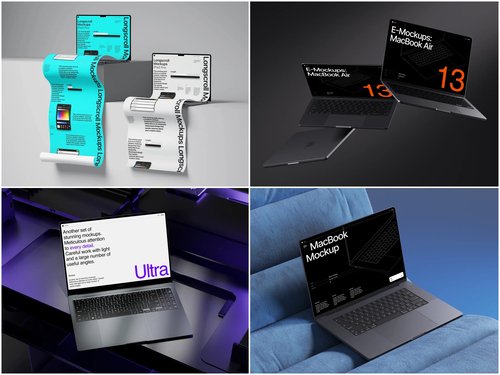
Presenting a digital product is never just about the pixels inside the screen. The frame around those pixels—the device, the setting, the mood—shapes how fast a viewer trusts what they’re looking at. That’s why choosing the right laptop mockup is a decision that deserves more thought than most teams give it. A mockup built for enterprise buyers and one built for casual consumers are, in practice, two completely different visual languages.
Why the Audience Changes Everything
B2B and B2C audiences don’t just want different products—they read visuals differently. A procurement manager evaluating SaaS software is scanning for credibility signals: clean interfaces, realistic screen glare, a device that looks like it belongs in an office. A consumer scrolling Instagram, on the other hand, responds to warmth, lifestyle context, and a sense of “this could be my desk.”
This isn’t a stylistic preference—it’s measurable. Marketing teams have long noticed that product screenshots dropped into a lifestyle scene get more engagement on social platforms, while the same screenshots on a plain, isometric background perform better on landing pages aimed at business decision-makers. The mockup is doing psychological work before a single word of copy gets read.
B2B Mockups: Precision Over Personality
Business audiences are usually short on time and skeptical by default. They’re comparing your dashboard to three others open in different tabs. A B2B-oriented mockup needs to:
- Show the interface at a size and angle where text and UI elements are actually legible
- Use neutral, professional backgrounds—think studio gray, soft gradients, or minimal office settings
- Avoid distracting props or aggressive color casts that pull attention from the product itself
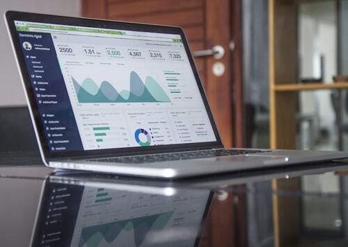
A good real-world example: SaaS companies showcasing analytics dashboards on their homepage almost always use a straight-on or slightly angled laptop shot with a plain background. This is deliberate. It mimics how the buyer will actually use the product—at a desk, focused, without visual noise. Fintech and HR-tech landing pages follow the same pattern for a reason: it signals “this is a serious tool,” not “this is a lifestyle app.”
B2C Mockups: Context Sells the Feeling
Consumer products live or die on emotional resonance. A meal-planning app, a photography portfolio, a fashion e-commerce site—these need mockups that feel lived-in rather than staged for a boardroom. A B2C-oriented mockup should:
- Place the laptop in a believable, everyday setting—a coffee table, a wooden desk near a plant, a sunlit corner of a room
- Lean into warmer lighting and natural textures instead of sterile studio conditions
- Leave room for small human touches—a cup, a notebook, a blanket—that suggest a real person, not a demo environment
This is where lifestyle-context mockups outperform sterile ones. Etsy sellers showcasing digital planners, indie app developers on Product Hunt, and course creators building sales pages all lean into scenes that feel personal rather than corporate. The goal isn’t to prove competence—it’s to help the viewer imagine themselves using the product in their own life.
Practical Scenarios Where the Choice Matters Most
The gap between the two approaches becomes obvious once you look at how it plays out in practice.
A B2B startup once pitched investors using a casual, sunlit desk mockup in their deck; reviewers felt the presentation didn’t match the seriousness of the ask, and the team swapped it for a clean studio shot before the next funding round.
An indie developer promoting a journaling app on Twitter initially used a plain gray background for consistency, then noticed engagement improve noticeably after switching to a warm, home-office style scene that matched the emotional tone of the app itself.
Agencies building case study pages for enterprise clients tend to go the opposite direction, standardizing on neutral backgrounds across every project specifically so the portfolio reads as consistent and professional rather than scattered.
These aren’t hypothetical—they reflect patterns designers and marketers report again and again when testing creative variations across landing pages, decks, and social posts.
Finding the Middle Ground
Some products don’t fit neatly into either category. Freelance tools, prosumer software, and hybrid platforms often benefit from a blended approach: a realistic device shot with just enough environmental context to feel human, but clean enough to still read as professional. Resources like ls.graphics offer a wide enough range of laptop scenes—from minimal studio setups to warmer lifestyle angles—that teams can test both directions without commissioning custom photography for every campaign.
The practical move is to treat mockup selection the same way you’d treat any other conversion element: test it. Run the clean, professional version against the lifestyle version on your actual landing page or ad set. Audiences rarely lie in the data, even when their stated preferences suggest otherwise.
The Takeaway
There’s no universally “better” laptop mockup—only a better fit for who’s looking at it. B2B audiences reward clarity, restraint, and realism that signals competence. B2C audiences respond to warmth, context, and a sense of everyday life. Knowing which one you’re designing for—before you even open your design tool—saves time, sharpens your messaging, and gives your product the visual context it actually deserves.